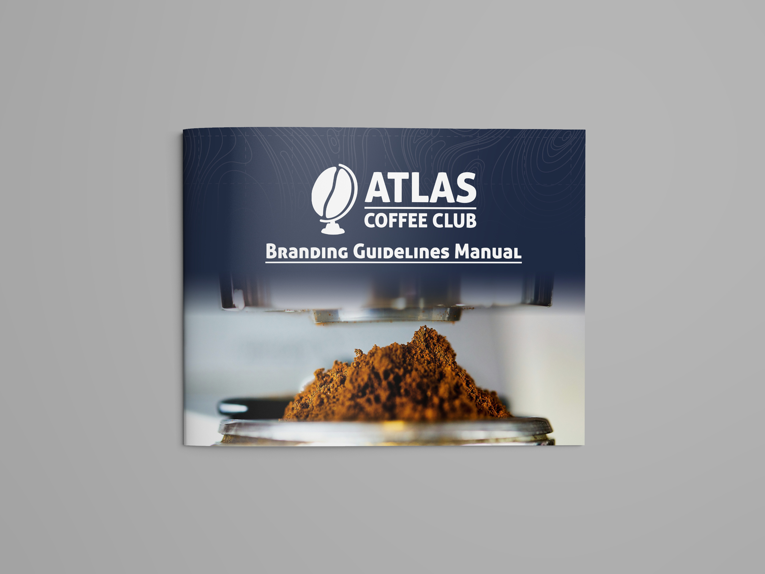
In a semester-long brand guidelines project, I took on the challenge of redesigning the Atlas Coffee Club brand to elevate its presence and differentiate it from other “Atlas” branded coffee companies. Over the course of the semester, I developed a new visual system, including a distinctive symbol and refreshed logotype, a stationery suite, and nine brand-application mock ups. The goal of the redesign was to reflect the brand’s adventurous spirit and global coffee culture roots. These elements were then compiled into a polished brand guidelines manual.
Programs Used:
Adobe InDesign | Adobe Illustrator | Adobe Photoshop | Adobe After Effects | Adobe Dimension
Atlas Coffee Club
Branding Guidelines Manual
Brand Identity Design, George Mason University

The rebranding process began with exploratory pencil sketches to develop a distinctive brand symbol that would visually set Atlas Coffee Club apart from other “Atlas” coffee brands. I experimented with multiple logo concepts, each reflecting a different facet of the brand’s exploratory identity, while intentionally steering clear of common coffee-brand clichés.
Initial Logo Sketches
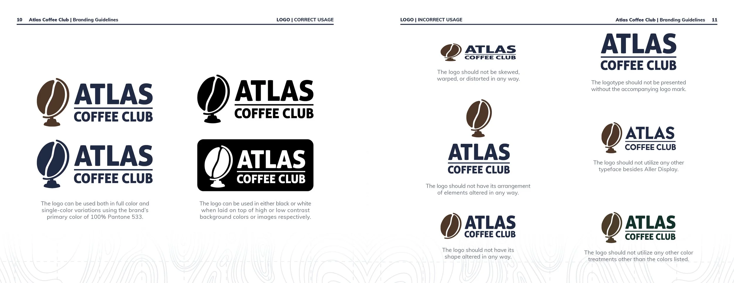
The strongest logo sketches were then digitized to refine their details and test their versatility across different sizes and applications. This stage helped clarify which concept worked best as an enduring brand symbol; a simple, recognizable mark that captured the brand’s spirit without relying on overly illustrative details that could be lost at smaller scales.
Digitized Logo Drafts


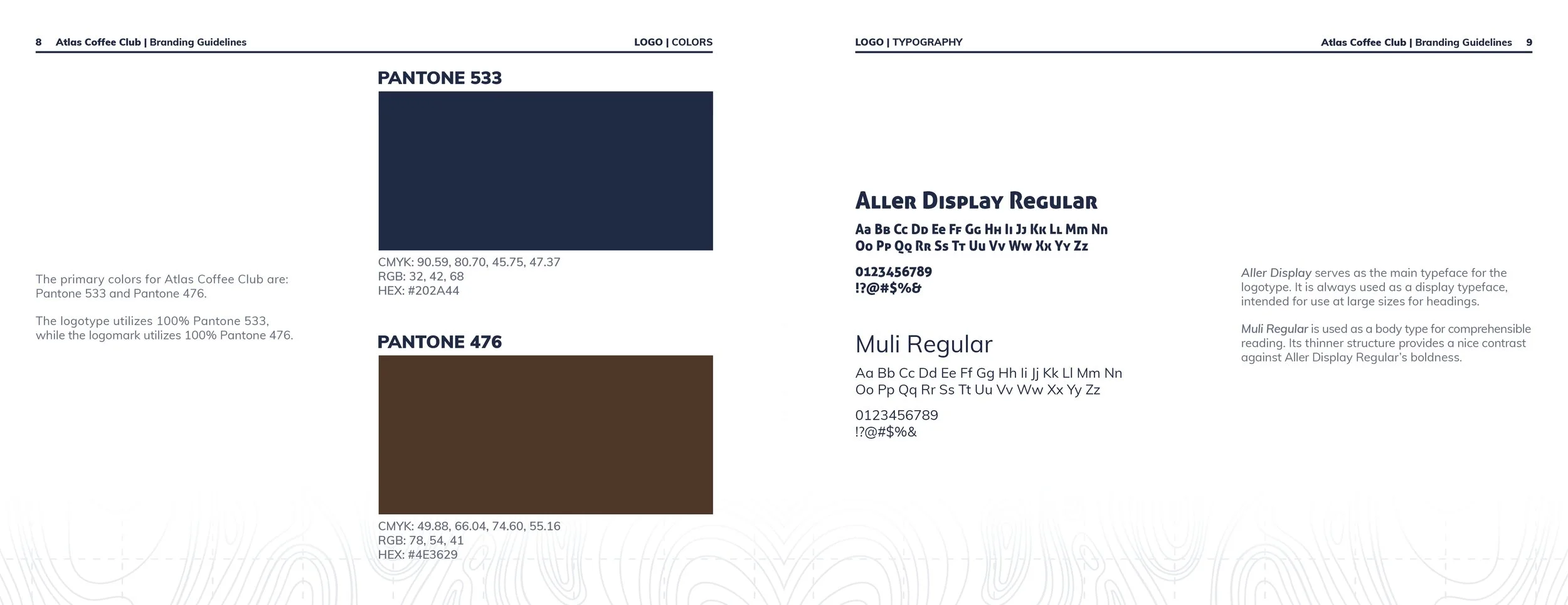
Finalized Logo & Spot Colors
The final logo was carefully refined for clarity, balance, and readability across all scales. A fresh blue and brown color palette was chosen to replace the brand’s previous black and white scheme, evoking freshness and approachability while distinguishing Atlas Coffee Club from competitors. The selected Pantone spot colors also provide strong contrast and legibility at full tint, allowing for use in both display and body text, and great lower tint options for increased versatility. This versatility makes two-color printing in the brand palette an affordable and cohesive option for future branded materials.
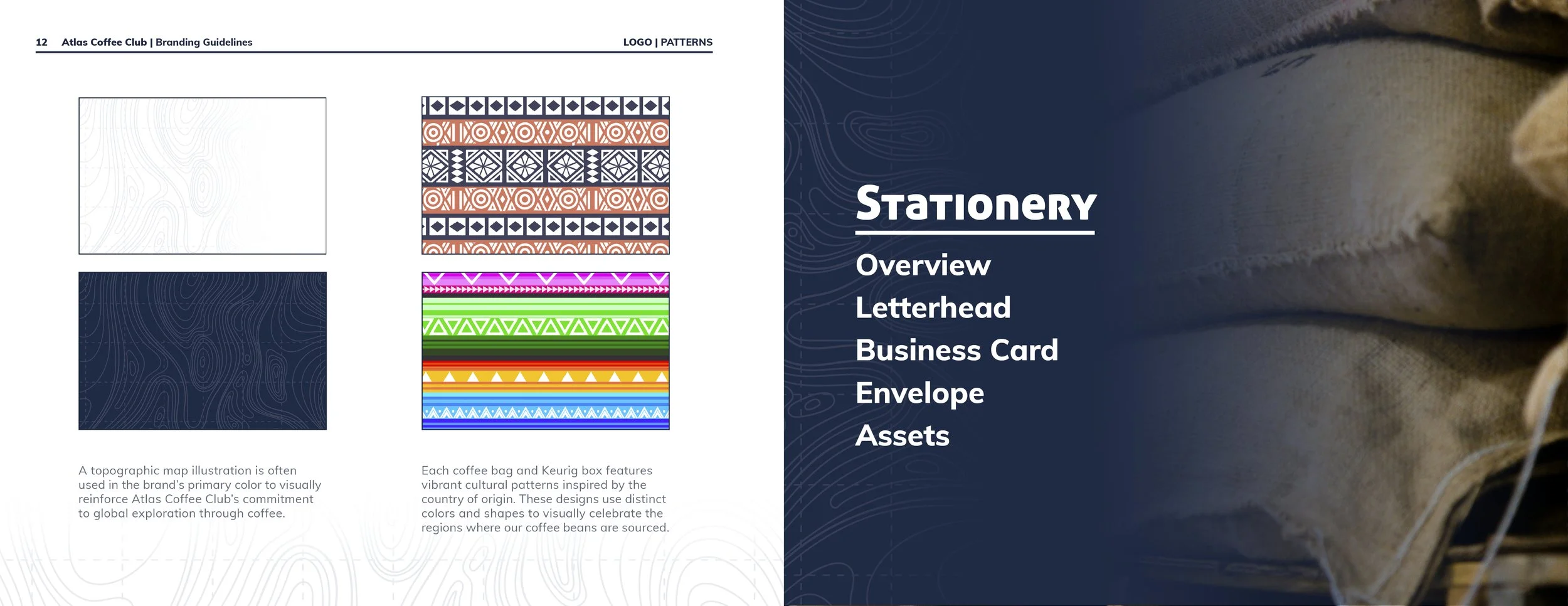
Topographic Design Motif
To reinforce the brand’s spirit of exploration, a topographic map pattern was also introduced as a unifying visual motif across deliverables. This design element ties back to Atlas Coffee Club’s mission of connecting customers with coffee
from around the world; inviting them to explore the world, one cup at a time.


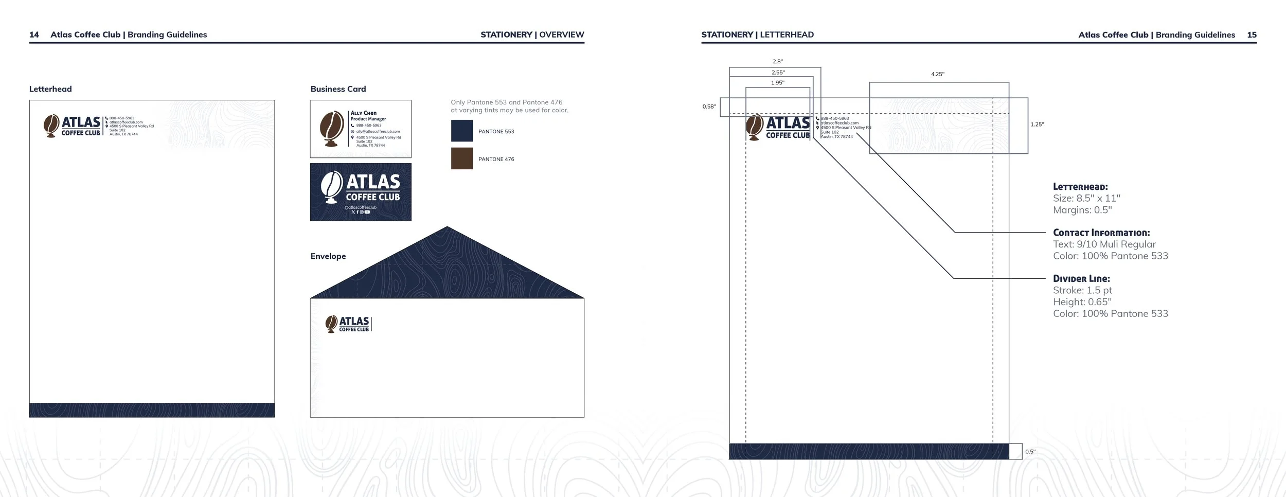
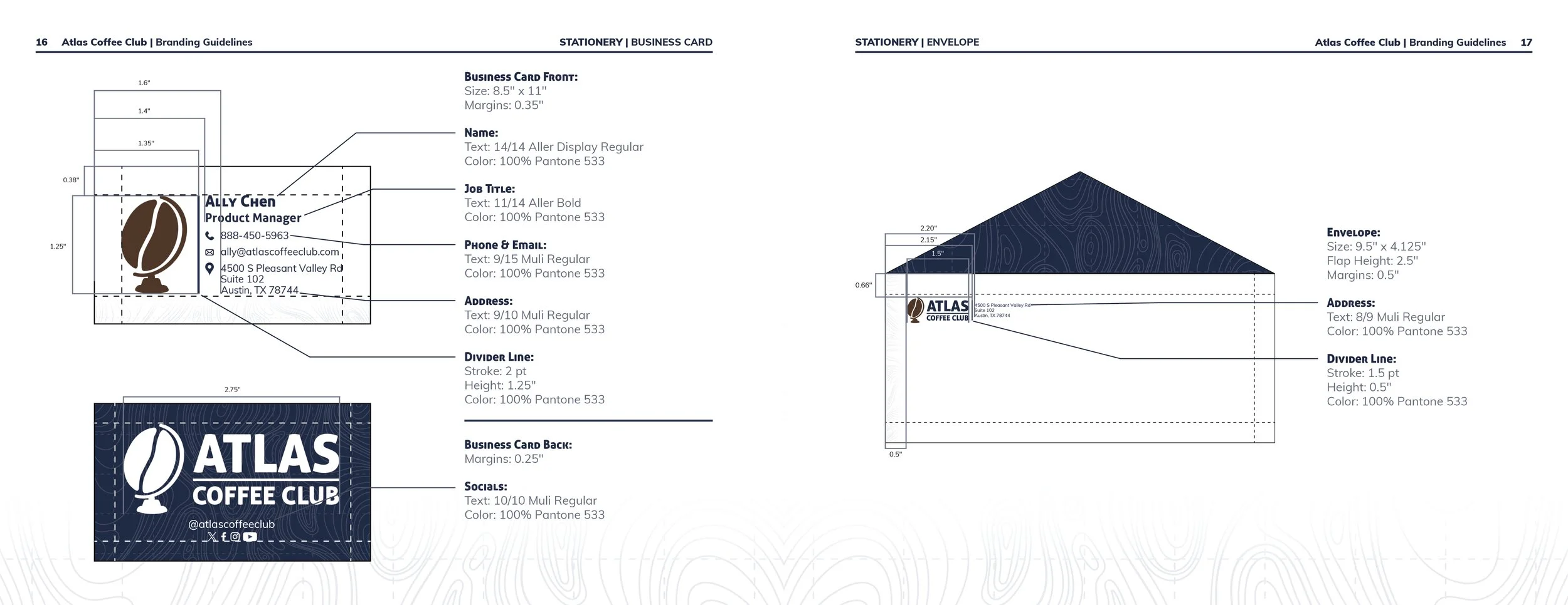
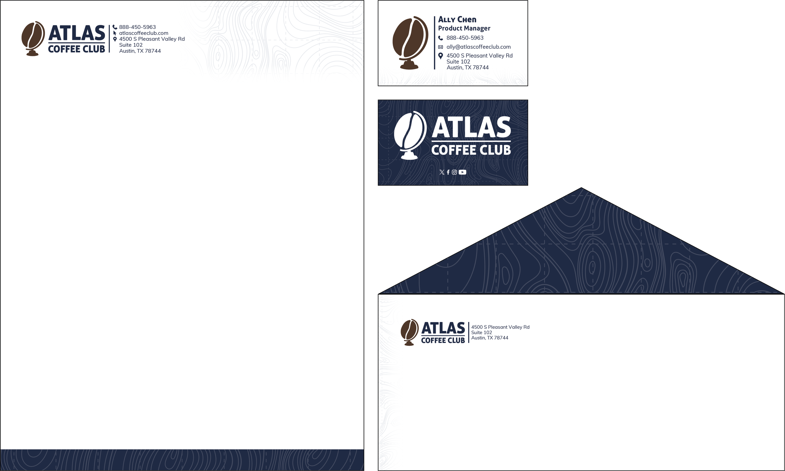
A cohesive stationery system was then developed to showcase the new brand identity across practical applications. The letterhead, business card, and envelope each feature two-color printing in the brand’s palette and incorporate shared graphic elements and typography to create a unified, professional system that reflects the clarity and consistency of the rebrand.
Stationery System
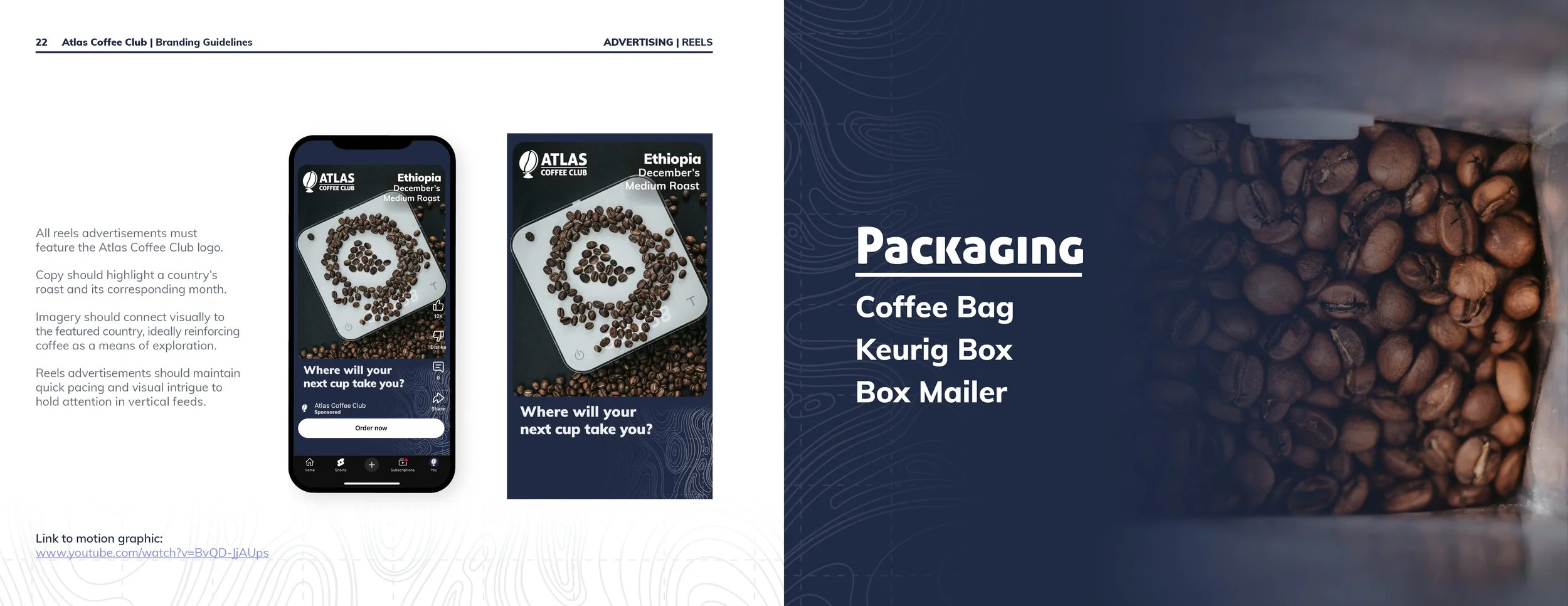
To showcase the rebrand in action, a series of advertising mockups were created, including a web banner, Instagram ad, and motion-designed YouTube Shorts ad. These applications highlight how the refreshed visual identity adapts across digital platforms, maintaining consistency while capturing the brand’s energy and sense of global adventure.
Advertising


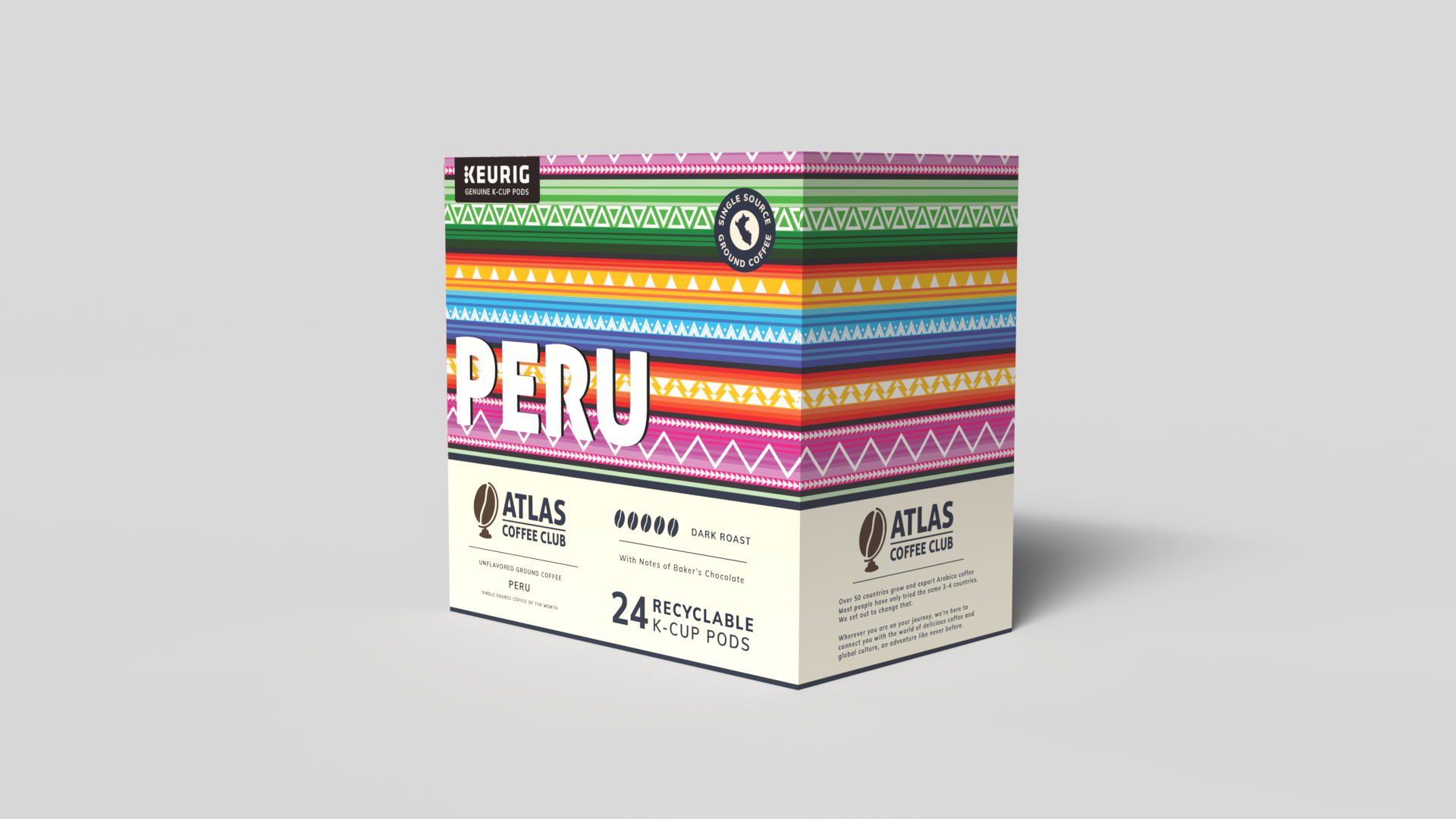
The rebrand’s packaging system was designed to celebrate global coffee culture while maintaining brand cohesion. The coffee bag and K-Cup box feature cultural patterns inspired by the origins of each roast, connecting customers to the regions they’re “visiting” with every cup. A complementary cardboard mailer was produced using a single ink, the brand’s signature blue, offering an affordable yet distinctive packaging solution that reinforces brand recognition while remaining affordable.
Packaging


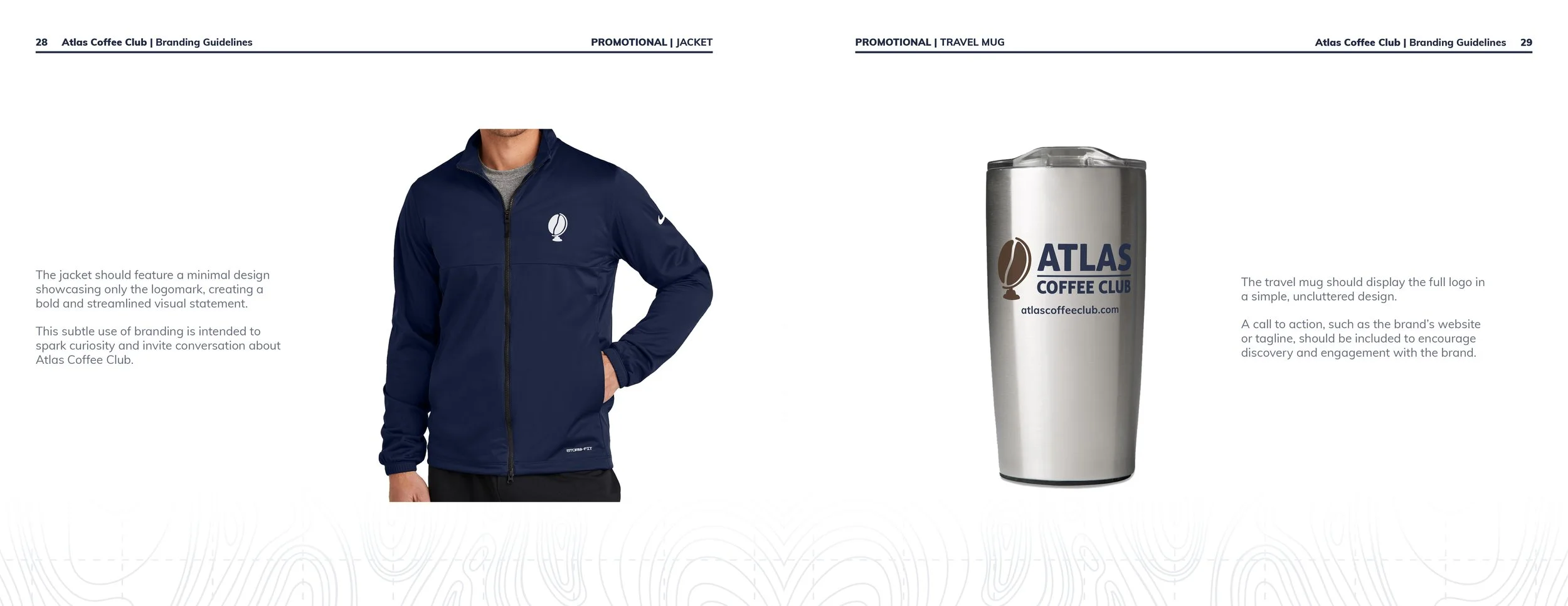
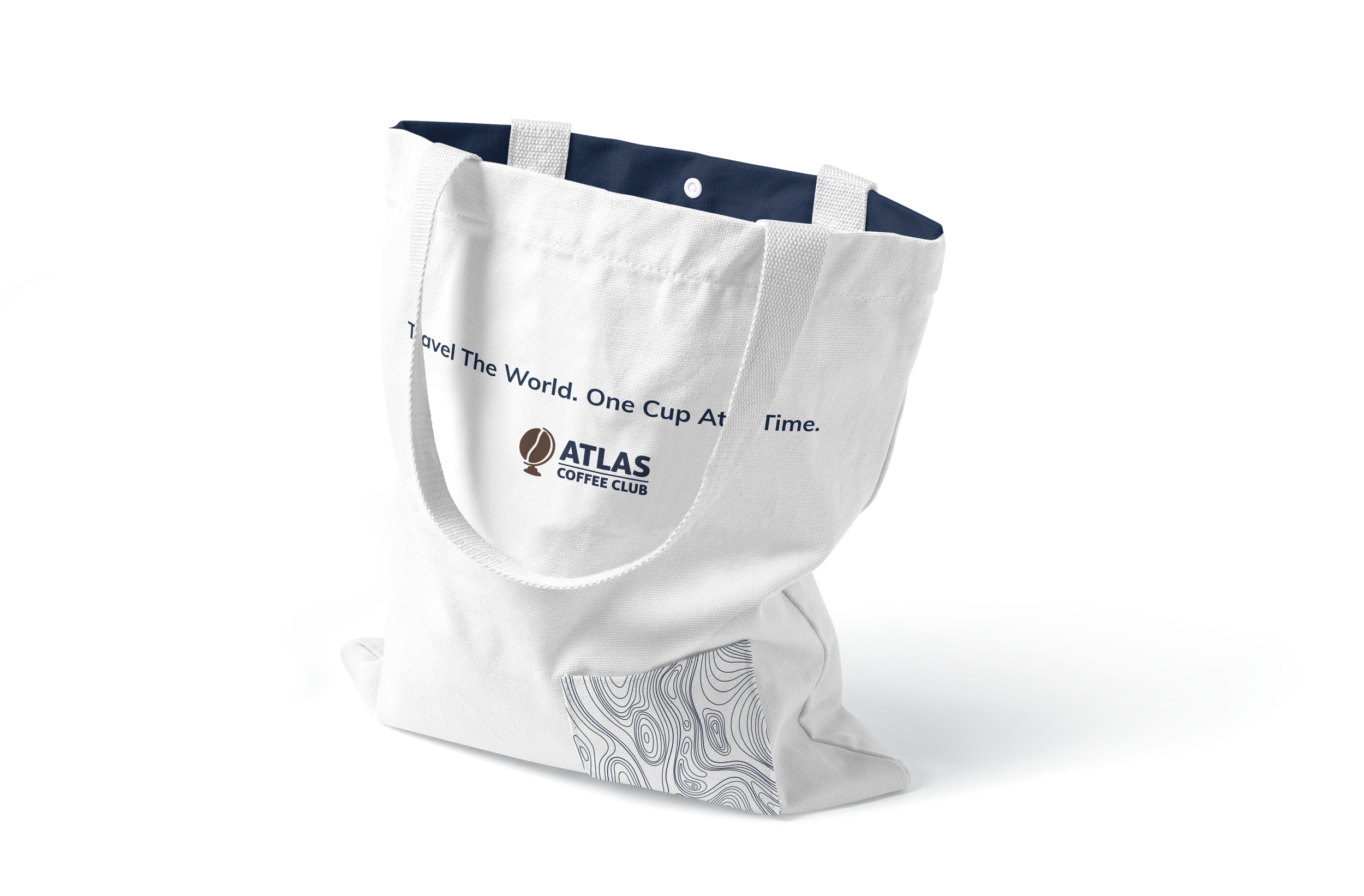
To extend the brand beyond the product, a set of promotional materials was created, including a coffee tumbler, zip-up jacket, and tote bag. Each item was designed to spark curiosity and invite conversation, allowing the brand’s identity to live in everyday experiences while encouraging onlookers to learn more about Atlas Coffee Club’s story and mission.
Promotional Materials


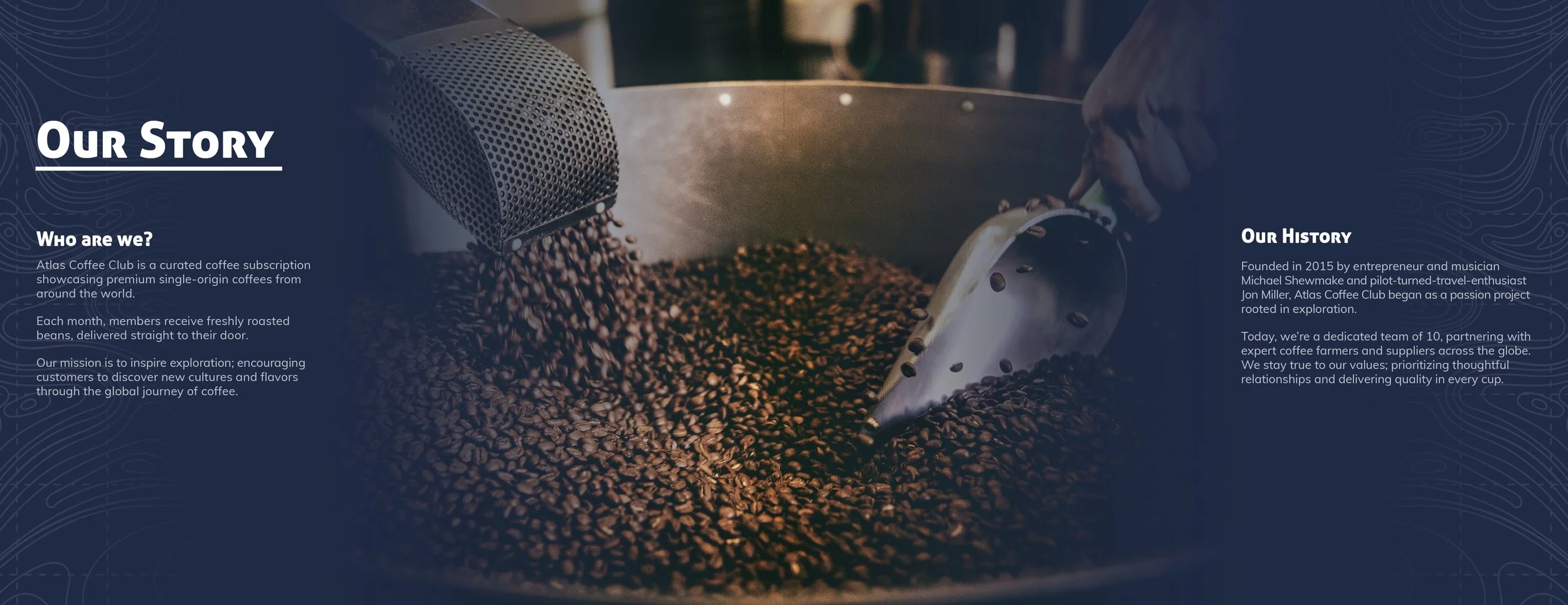
All elements of the rebrand were compiled into a comprehensive branding guidelines manual. The manual outlines the goals and vision behind the rebrand while providing detailed guidance on logo usage, color application, and typography. It also showcases how the refreshed identity would be seen across stationery, advertising, packaging, and promotional materials; presenting a complete, cohesive vision for Atlas Coffee Club’s renewed brand presence.
Branding Guidelines Manual


